Alternative Outcome Combo’s

Tags

, , , , , ,

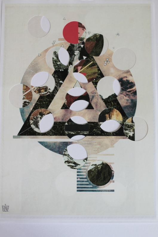
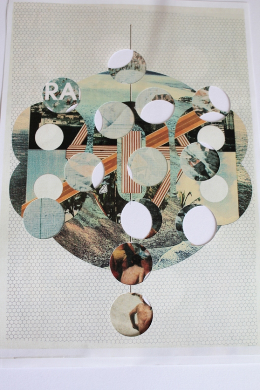
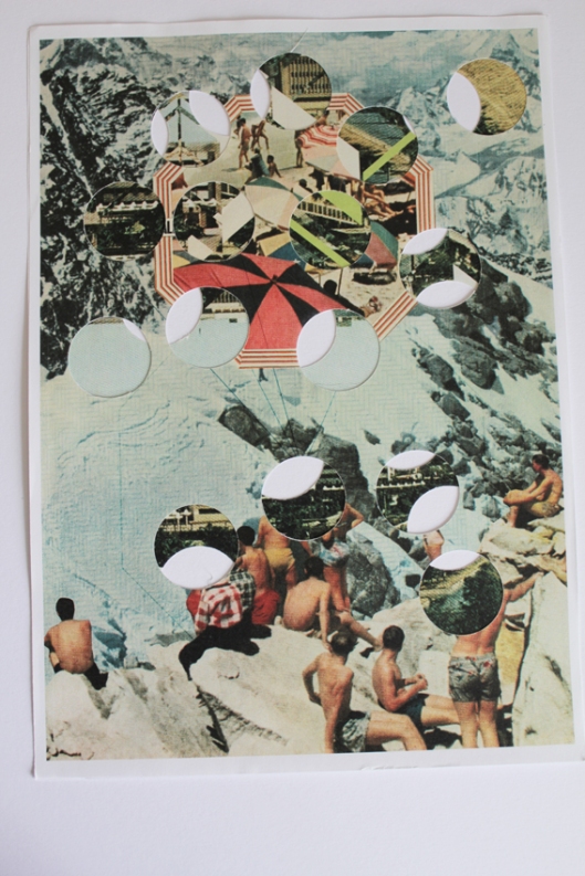
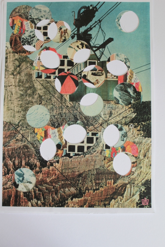
Just thought I would post some images of a side edition of illustrations that I created somewhat by chance – something that fits in nicely with my collage and de-collage research completed throughout this Major Project.

After making my selection of badges from my chosen illustrations a couple of weeks ago, I discovered that the remaining segments of the paper illustrations used actually retained a unique visual aesthetic, a new compositional form that told a completely different narrative to the original. The ‘random’ circular cut outs that remained from the badge making process allowed for a greater emphasis of contrast between the positive and, now almost equally dominant, negative space, an ideal opportunity to experiment further with physical layering and depth.

By ‘mixing and matching’ various illustrations on top of one another, exciting new combinations were visualised, transforming each original narrative into new worlds in which situations would overlap and collide into the other. This gave birth to a degree of visual balance and unbalance, the final narrative of which would ultimately lay at the hands of the individual imagination, subject to their own decision making and extent of manipulation.

This process has been especially intriguing and enjoyable, witnessing at first hand, the tactile and, somewhat instantaneous, ways of seeing my illustrations transform, evolve and grow from their original state.

I have tried to photograph some of the results with as best camera and natural lighting that I could, but I would ideally like to mount some of these up for my final summer graduation exhibitions or perhaps bind them together in a series as an alternative accompaniment to my original illustrations.


Yay!

Tags

, , , , , , , , , ,

This was my word of choice when I received my package from Moo a couple of days ago, a company who are so confident in predicting what their customer’s reactions will be, place stickers of this exclamation on the front of their packaging (as is evident below)

They certainly didn’t disappoint in this instance. In preparation for my forthcoming summer graduation exhibitions, I placed an order for business cards, postcards and stickers. I only really needed business cards and postcards, the postcards of which were going to be included as part of my book that I have created for my final major project, but being able to have different fronts but only one back design meant these would have to be printed by other means. Instead, I used the opportunity to create postcards with a shortened CV on the reverse – a way to hand out a larger copy of my illustrations, with background information and a badge attached to the front as a direct point of contact contained within a tactile entity. The sticker books were a last minute decision before checkout, when I noticed that 90 stickers cost a mere £4. Incredible! Naturally I purchased 2 sets and went to town with designing a different design for every single sticker with Moo’s infinity print.  

Having purchased from Moo in the past, I knew the quality was going to be very high, but the overall packaging and their combination of functionality with aesthetic beauty, places this printing company in a league of their own. These touches make the whole experience feel a great deal more exciting and pleasurable than you would expect when receiving a box of cut up cardboard. So thanks to you Moo!

Be sure to pop along to this years Free Range from the 2nd-6th June @ the Dray Walk Gallery or to New Designers from the 6th-9th July Stand VC 18 to pick up your own DG Designed Moo Card / Sticker!

Additional Portfolios and information on DG Design can now be found at the following links –

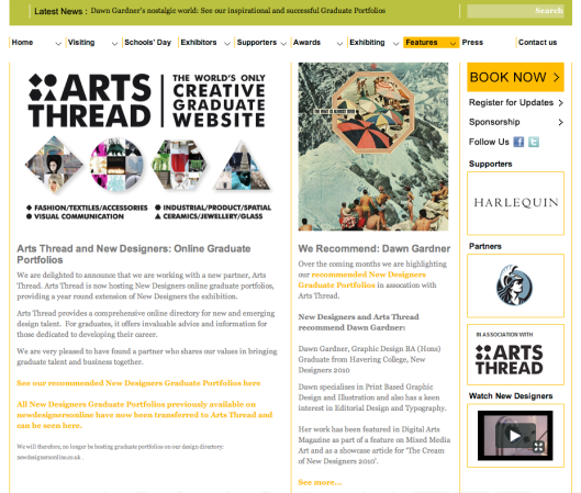
New Designers and Arts Thread

Free Range

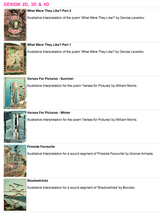
And on the New Designers Features Page, where my Arts Thread Graduation Portfolio has been selected as their recommended choice for the month of May.


An Update

Tags

, , , , , , , , , , , ,

Although I have been wanting to post an update for quite sometime, everything has been happening at such a fast past over the last few weeks that I have had little time to actually complete the tasks required let alone blog about them.

I had a super productive Easter break which I am so relieved about now given the limited time we have left, and knowing full well that it is usually the finishing details and printing matters that end up causing the most problems and time consuming last minute unexpected challenges.

Hopefully this post will provide a brief run down of the last few weeks and detail the work that still needs to be completed before hand in on the 12th May . . .

Book Design has been finalised, with a mock up version printed to scale to ensure the double sided printing worked as anticipated in conjunction with the folded pages and physical flip book structure.

Paper has been sourced, tried and tested and purchased for copies of the Book, accompanying Postcards and A2 size Illustrations, from Atlantis. 

A Book Bindery has been sourced and confirmed that will be able to fulfill my binding requirements to within my rapidly decreasing budget. As long as all of the inner content and front covers are printed, cut and folded in time to be delivered to them by the end of this week, I should, fingers crossed, be able to have the bound copies back just in time for the final hand in date. 

Promotional material has been designed and sent to Moo for printing.

Mini visual Badges have been designed and made with the help of Steve’s Badge Maker.

Vinyl Logos for the Book Front Covers and Postcards have been designed and printed onto the coloured vinyl sheets with the help of Tom and Becontree Signs.

Online portfolios have been set up on Free Range and Arts Thread, and Exhibitor Badge Forms sent off to New Designers.

A2 Portfolio has been purchased with planning underway on its construction.

Permission letter has been sent to Estates in relation to Exhibition Board Painting for 2 weeks time.

Post Graduate Study has been planned and drafted in brief form, although lots of work is still required on this.

Evaluation of the Major Project is needed before final hand in, along with another copy of the original proposal.

And bunches of left over daffodils from the actual royal wedding now sit in vases throughout my house.

I am so excited about everything to come, very much looking forward to all of the exhibition planning left to do, and although I am incredibly nervous about deadlines and results to come in the future, I couldn’t be more optimistic about the days ahead.

Wim Crouwel Retrospect Exhibition @ Design Museum

Tags

, , , , , , ,

On Wednesday 6th April, I attended the Wim Crouwel Retrospect Exhibition – A Graphic Odyssey – @ the Design Museum, London.

The exhibition definitely lived up to my expectations and it so was so refreshing to witness a minimalist clarity and confidence with regard to the curation, ensuring an open plan, white walled space and functional glass tables allowed the work on display to do all the talking.

The chronologically organised content covered everything that Crouwel has worked on during his amazing career, from the early logo and print design days to the more recent contemporary collaborations and teaching positions. A particular highlight, aside from the numerous printed material archives and large poster designs, was a slide viewing section of the exhibition – two long strips built into the glass tables which housed small transparency slides of various design work, logo and type experiments, exhibition curation spaces and other photography taken by Wim Crouwel during the 1950’s, 60’s and 70’s. Two magnifying lenses were placed over the top, allowing visitors to slide along the different slides and view mini snapshots documenting landmarks within his past career. A similar sort of device would have been amazing for the viewing of my own ViewMaster slides aside from the individual hand held viewer!

The accompanying catalogue was too hard to resist (even though I think the pricing of £16.95 was a little steep) some images of this can be seen below, and is a nicely designed addition summarising the content of the exhibition as well as offering some exclusive interviews with the man himself alongside photography led pages.

I have also completed a little review summary, which goes into more detail about the various sections of the exhibition, the content of which can be seen below:

How is the exhibition packaged? What promotional material is available? What information is communicated?

Promotional posters, A5 postcards and A5 information booklets are available at the entrance to the Design Museum. The promotional material follows a minimal style, with gridded information and simplistic info graphics for the floor plan and navigation. Background information is displayed throughout the exhibition, with a mini biography and timeline of career placed on the inner walls at the start of the exhibition. The overall design aesthetic is sympathetic to Crouwels’ design style, and margining of innovation and traditional modernism.

What is the purpose of the exhibition? What type of artefacts are displayed?

The purpose of the exhibition is a retrospect for Dutch designer Wim Crouwel. The exhibition is staged to detail various eras within his life and working career, showcasing examples of his print work, logo design, typographic design, visual branding and identity and lesser known exhibition design work. Large white tables with sunken glass windows showcase an array of printed material that Crouwel has completed over the years for various design companies taken from his own archives, whilst large posters, logo designs, bio information and video projections of exhibition design spaces adorn the surrounding wall space.

If there is any merchandise available how does it compare to the artefacts on display? Is it an image printed on a t-shirt, mug or umbrella, for example? Or is it an artefact that could be included in the exhibition?

The merchandise available includes a catalogue book to accompany the exhibition content, providing the bio info, interviews with Crouwel himself and reproductions of all printed design material showcased inside. There are also A5 postcards available to purchase, larger posters, mugs and a special cover edition of Wallpaper Magazine who were the media partners to the exhibition.

How is the exhibition designed? How is the viewer guided around the exhibit? How well does the exhibition use the space?

The overall exhibition evokes a minimalist style, encompassing a very modernist approach, emphasized through white walls and slick glass tables, creating clarity, a degree of elegance and a neutral backdrop for the work on display. The layout of the tables, which dominated the majority of the inner exhibition space, was designed to enhance easy navigation for the visitors, and to work in chronological date order from early career through to later projects and teaching. The tables at various intervals were also raised, providing a subtle platform for the work on display to become united with the wall space in the background, a subtle yet effective touch to guide the eye. The addition of video projections, TV screens and small speakers build into the tables also provided an interactive element that helped to bring the remaining stationary elements to life, adding a greater interpretation of the character of the designer. The one slight downside to this was that the lighting was fairly dark, so that the projections could be easily seen, which although the reflective quality of the white glass tables helped to reflect the overhead spot lights, the overall atmosphere in the corners of the space were a little dull.

What risks might be encountered in exhibiting this work?

The only possible risks identified were that during busier viewing times, and especially those who need to use wheelchairs, the spacing between the tables could quickly become quite cramped and might be trickier to navigate around easily when more people are positioned at various points along the route. Some small TV screens were also located on some of the walls, which again if not secured efficiently, could fall and hurt someone nearby.

The no photography policy meant that I was unfortunately not able to capture the parts of the exhibition myself – the following images have therefore been sourced from the internet and from various magazine review’s from the likes of Creative Review and such.

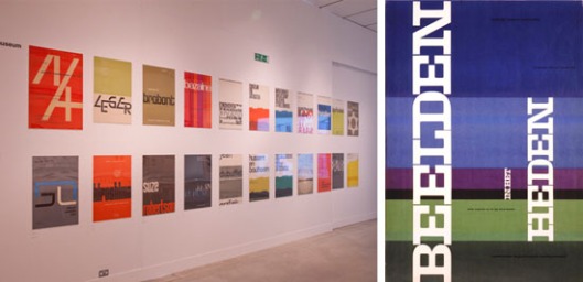
I would highly recommend you all to visit this retrospect before it closes early July. The £5 – £10 entry fee is definitely money well spent, and the gift shop @ the Design Museum is an excuse to visit in itself.

A good week :)

Tags

, , , , , , , ,

Having received my 3D ViewMaster slides at the beginning of the week I was feeling positive about my remaining workload and looking very much forward to attending the opening night of Pick Me Up @ Somerset House. The contemporary graphic art fair was a huge success last year, and with numerous live events and print studios showcasing their work, this year certainly didn’t disappoint either. The first live event was yesterday evening running from 6-9pm.

Titled ‘Heavy Pencil’ the event consisted of a selection of illustrators producing live drawings in response to live music and poetry readings, the results of which were projected onto one of the gallery walls for everyone to see the stages of each drawing and the techniques used by each illustrator. This theme fitted perfectly with the aims of my project, centered around interpretations from written and aural stimuli so I was interested in seeing the results.

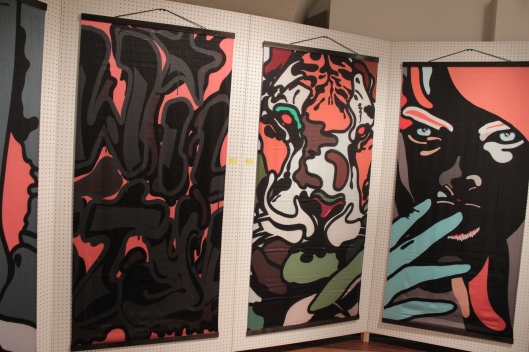
I have posted some pictures below from the event, including some of the work that was showcased in the main gallery and the action within the print studios. The Anthony Burrill workshop was a hive of activity, with tables and benches littered with paper, pens and other materials available for you to sit down and get creative for free. The live drawing sessions were really interesting in seeing how well known illustrators begin their drawings, the choice of media they use and how none of the participating illustrators worked in pencil prior to finalising the design. Some video footage from the event was taken, links of which will be placed on Scott Coleman’s blog in due course.

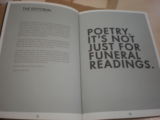
A small purchase was made in the form of a book based on poetry and illustrative interpretations (think I may have tapped into an up and coming trend here!) which can be seen below as well.

Pick Me Up @ Somerset House runs until the end of March and is well worth a £5/£7 entry fee 🙂

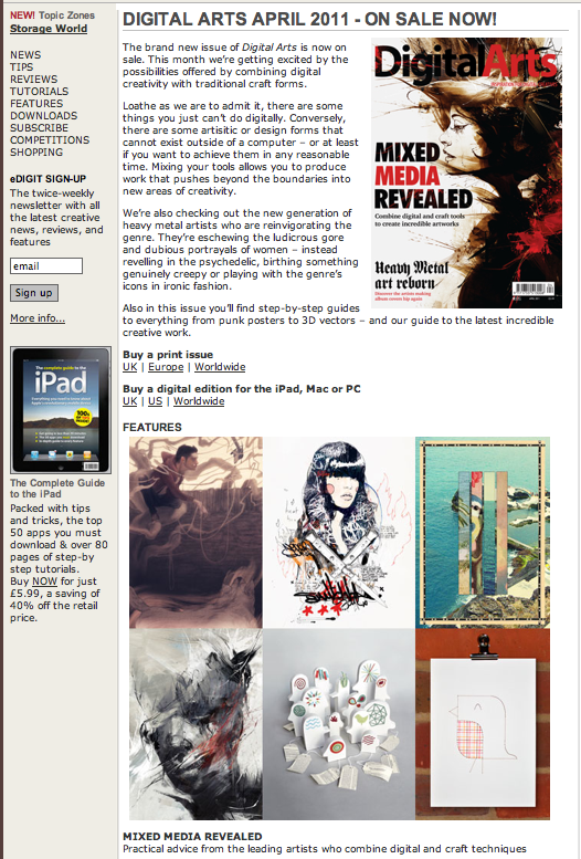
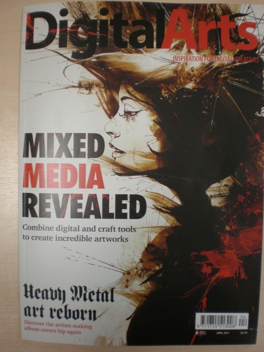
Digital Arts Magazine April 2011 Issue

Having been contacted a few weeks ago by a freelance writer about an up coming feature for Digital Arts Magazine, I jumped at the chance to be involved. Said feature was based on Mixed Media Art, investigating the hand rendered and digital processes that artists use when creating mixed media illustrations.

The April Issue came out a couple of days ago, and I was pleased to see a couple of my illustrations were showcased alongside some of my comments made about the process and how I like to work.

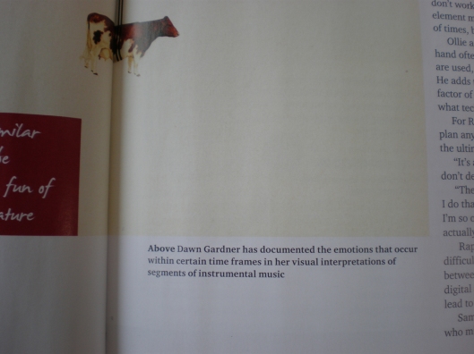
Some of the images can be seen below, better close ups will be taken shortly!

[These first two images are taken from the Digital Arts online website, the top far right image in the first picture is my work.]


Thank you to Eva Peaty and everyone @ Digital Arts Magazine for including me within this feature 🙂


They’re Here !

Tags

, , , , , , , ,

Having decided on my final selection of 14 illustrations (7 poetry / 7 music) to translate to 3D courtesy of ViewMaster Reels, I then spent a couple of days reworking the designs to conform to the necessary proportions of the 3D template. The final size of each image when located on the reels measures a tiny 11mm which, along with the pixel size restriction,resulted in a fairly small area to work with!

In brief, the 3D process is made possible through the combination of layers and shadows. When working within Photoshop, each layer that you desire to have projected away from the background content requires an accompanying shadow. As a result, the more layers you work with, the greater the  final 3D experience. The ViewMaster works by translating two separate versions of each image, the layers and shadows, so that when printed at opposite locations on the reel, and looked through the viewer, these images merge together to create a 3D projection of the environment. Even though the image is reduced to such a small scale, the printing process ensures that the quality is maintained, resulting in a vibrant real life three dimensional visual experience.

Taking only 4 days to arrive from America, my package arrived in the post this morning, and the final result is amazing! Although you won’t be able to get much of an idea here, I wanted to post a few pictures of the ViewMaster and reels to further illustrate the process. The 3D aspect certainly adds so much more dynamism to the final illustrations and help to encapsulate the viewer into little worlds where anything is possible.

I am really looking forward to showcasing these at my forthcoming exhibitions in the Summer to see other people’s reactions.

If you are interested in finding out more information on this process or would like your own ViewMaster reels created, then Studio 3D has all the information you need inc. detailed templates and price lists. Ron and his team were incredibly helpful to deal with and offered an excellent service and quality product.

UPDATE:

I’ve been struggling for what seems to have been a lifetime with creating an effective yet incredibly simple, stripped down logo for my major project. Although an icon type logo is in no way a necessity, the lengthly title prompted me to investigate a complimentary icon that would be able to be descretly located throughout the design components without detracting away from the layout of the book or illustrations.

Whilst working on another illustration I created a unit of shapes that resembled everything I have been striving for, completely by chance. Don’t you just love it when things like that happen?

Anyway, below is a mini snapshot, I would love to get your criticism (hopefully more positive than negative, obvs.) Needless to say this skill is by no means my strong point, so I will welcome suggestions, namely from the ‘icon man of the moment’, Mr. Thomas Barden I talking to you 🙂

(I know this isn’t really the point when discussing logos, i.e they should be self explanatory, but anyway, its representing the title ‘Image / Word / Sound’ just so you all know!)

Copyright 2011 Dawn Gardner

Thank you ! 🙂

Your Thoughts . . .

Tags

, , , ,

UPDATE: THE COLOURS LOOK VERY BRIGHT BUT ONCE YOU CLICK TO ENLARGE THE IMAGE THESE TONES ARE CORRECTED !

. . . on this illustration would be very much appreciated !

What moods, emotions, objects, themes, interpretations come to mind when viewing this piece? Write a little description in the comments below – be as specific and in-depth as possible please !

Any considerations on possible improvements would also be welcomed.

Thank you in advance 🙂

On another note, does this look as though the man is walking through the archway? Any ideas on how to make it look more effective and three dimensional?!

Thank you 🙂

Copyright 2011 Dawn Gardner

Copyright 2011 Dawn Gardner


In Love . . .

Tags

, , , , , , , ,

. . . with this piece of motion collage.

It is literally the complete opposite of the motion example I posted a couple of days ago, particularly in terms of pace and complexity of composition, but I absolutely love it.

Hats off to the team behind ‘Hello, Savants!’ for creating something so visually hypnotic, I actually can’t figure out how you managed to create something so highly detailed as this. My only wish is that a slow mo version could be created so that all of the visual stages can be appreciated for longer.

What do you think? Thank you to Scott for sending me the link 🙂

Complete Accidental Inspiration

Tags

, , , , , ,

Whilst paying a flying visit to one of my current favourite design blogs, Not Paper, I chanced upon a new collage artist who left me feeling not only completely in awe, inspired and somewhat mesmerized but also greatly tempted to take a slight deviation and actually take the plunge in experimenting with something that I have been contemplating doing for a while now. Although my project is hugely based around 2D design concepts and purposes, I have already explored the possibility of implementing a three dimensional element, with the aid of my View-Master slides, which will be printed in America. I am super excited about the effect this medium will have and feel it will be of enormous benefit when showcasing my concepts in my final exhibitions.

However, I have also been exploring the possibility of creating some form of moving image collage which could relate back to my presentation for the concepts and ideas module, and again reference the image / word / sound link perfectly. There are many reasons as to why this idea hasn’t of yet been taken any further, the primary difficulty mainly being in relation to the length of time such a feature would take to create, and I have been more concerned with ensuring that I produce a strong body of work consisting of 2D illustrations / 3D View-Master slides and accompanying book rather than taking on too many disparate entities at once.

This video example certainly changes my mind. Although I am one who likes to ‘follow her instinct’ I am very much undecided on this one. Should I follow my heart or my head? I’m afraid this may need to remain just an aspiration for a future project . . .

Nathaniel’s description for these ‘motion collages’ reads:

‘For the past several months I’ve been cutting up and digitally collaging together short films/music videos entirely out of old National Geographic magazines. For lack of a better term, I’ve been calling them “motion collages.”

After scanning in my cut outs, I collage together scenes and then subtly inject them with life using AfterEffects. The results are slowly paced audio/visual stories that have been said to “make you feel like someone something slipped into your coffee.”

What do you think?


Cutting Edges: Contemporary Collage

Tags

, , , , , , ,

Having spent the last couple of months engrossed in creating my own hand rendered and digital collages, I was thrilled to discover a couple of weeks ago that Berlin based publishers, Die Gestalten Verlag, were releasing a brand new book dedicated entirely to contemporary collage. ‘Cutting Edges’ is a compilation of artists, designers and illustrators who implement collage as a primary medium within their designs, who have been chosen by James Gallagher – a renowned hand made collage artist.

The blurb reads:

‘Cutting Edges documents the new heyday of collage in current art and visual culture. Today’s artists, illustrators and designers are increasingly drawn to this artistic technique by the challenges of seamlessly melding traditional craftsmanship with skilled computer montage. They are not only comprising a wide variety of visual elements, but are also deliberately omitting, deleting and destroying them. This book is an inspiring collection of these unique examples of contemporary collage.’


I received my copy a few days ago and believe that it is the best £28 I have ever spent.

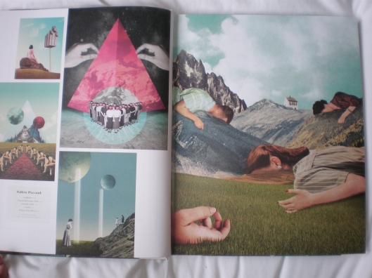
The overall quality of the book itself is superior to many other art and design books I own, the hardcover finished with a matt yet textured covering, the inside layout kept minimal and sensitive towards the diverse content held within, with every other page containing a full spread illustration example. The preface by Gallagher and background information of collage by Dr. Silke Krohn are insightful and raise questions which could be benefitial to document within my own project. The only slight annoyance being the chosen body typeface for the outer cover and image reference titles – ‘Sensaway’ has spaces for the joins in almost all of its letters, resulting in a lightweight font that is difficult to read, creating a blurred appearance especially when printed in a light turquoise colour.

These are just a few examples from the book, I have discovered so many new favourites, as well as rediscovered some old gems, which I hope will continue to feed into my current and future designs. This book is so worth the money, so if you have an interest in collage, the interaction between type and image or just enjoy the act of cutting and pasting, I would definitely recommend picking up a copy!

On a side note, lots of developments are being made regarding my final project, and I am hoping to further concentrate on the designing of my actual book to bring together all aspects of image / word / sound over the next 2 – 3 weeks.

Expect an update post with more details soon 🙂